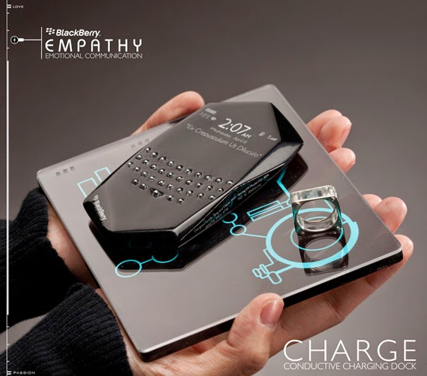
For their sponsored project held by RIM Blackberry at the Art Center College of Design, designers Kiki and Daniel had to incorporate an interface that integrates human emotions with the concept of social networking. The result of this exercise was the Empathy concept.
The phone is used in conjunction with a biometrics ring that is worn by the user to collect “emotional data”. Spec-wise it features a transparent OLED screen that becomes transparent when not in use and opaque during interaction. The front is all touch surface, while on the back there is a physical keyboard.
As Daniel describes the interface:
It is of course touch based and all the user’s connections are shown graphically so you can see who is connected to whom. Each contact has an avatar that is encompassed by two colored rings. The inner colored ring shows the contact’s previous emotional state, and the outer ring represents the contact’s current emotional state.

It is important to show the shift in emotions in order to see how an event has affected that contact.Another important feature that we felt was important was the “Emotional Health Chart”. This chart would monitor the user’s emotional health through an indefinite period of time. One would be able to see how a certain event, or phone call/ message has affected the user. Obviously, if the chart shows someone is always upset, there would be a problem…

If permitted, a user would be able to view other user’s charts as well.
source : design


No comments:
Post a Comment